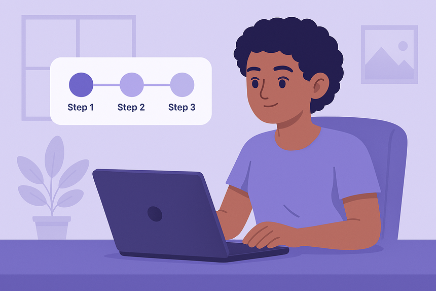
Multi-step forms are great for improving the user experience in long forms. Adding a step progress bar helps users see where they are and how much is left to complete — just like in sign-up wizards or checkout flows.
In this tutorial, you’ll learn how to build a step progress bar with HTML, CSS and JavaScript, ideal for beginners.
👁️ Preview
🧱 Step 1: HTML Structure
We’ll use 3 steps as an example:
<div class="progressbar">
  <div class="step active">Step 1</div>
  <div class="step">Step 2</div>
  <div class="step">Step 3</div>
</div>

<form id="multiStepForm">
  <div class="form-step active">
    <h2>Step 1</h2>
    <input type="text" placeholder="Your name" required />
    <button type="button" class="next">Next</button>
  </div>
  <div class="form-step">
    <h2>Step 2</h2>
    <input type="email" placeholder="Your email" required />
    <div class="btns">
      <button type="button" class="prev">Previous</button>
      <button type="button" class="next">Next</button>
    </div>
  </div>
  <div class="form-step">
    <h2>Step 3</h2>
    <p>Confirm your information</p>
    <div class="btns">
      <button type="button" class="prev">Previous</button>
      <button type="submit">Submit</button>
    </div>
  </div>
</form>
🎨 Step 2: CSS Styling
.progressbar {
  display: flex;
  justify-content: space-between;
  margin-bottom: 20px;
}

.step {
  flex: 1;
  text-align: center;
  padding: 10px;
  border-bottom: 4px solid lightgray;
  position: relative;
  font-weight: bold;
}

.step.active {
  color: #7179F4;
  border-color: #7179F4;
}

.form-step {
  display: none;
}

.form-step.active {
  display: block;
}

button {
  margin-top: 10px;
  padding: 10px 20px;
  background: #7179F4;
  color: white;
  border: none;
  border-radius: 4px;
  cursor: pointer;
}

.btns {
  display: flex;
  justify-content: space-between;
  gap: 10px;
}
⚙️ Step 3: JavaScript Logic
const steps = document.querySelectorAll(".form-step");
const indicators = document.querySelectorAll(".step");
const nextBtns = document.querySelectorAll(".next");
const prevBtns = document.querySelectorAll(".prev");

let currentStep = 0;

nextBtns.forEach(btn => {
  btn.addEventListener("click", () => {
    steps[currentStep].classList.remove("active");
    indicators[currentStep].classList.remove("active");
    currentStep++;
    steps[currentStep].classList.add("active");
    indicators[currentStep].classList.add("active");
  });
});

prevBtns.forEach(btn => {
  btn.addEventListener("click", () => {
    steps[currentStep].classList.remove("active");
    indicators[currentStep].classList.remove("active");
    currentStep--;
    steps[currentStep].classList.add("active");
    indicators[currentStep].classList.add("active");
  });
});
✅ How It Works
- Each
.form-stepis a different form section - The
.stepelements are visual indicators of progress - JS updates the current step and the visual bar as the user clicks Next/Previous
🧠 Bonus Tip
- Add smooth transitions using
transition: all 0.3s easeon.form-stepor.step - Show completion icons with a
.completedclass if desired - Store current step in
localStorageif user refreshes
✅ Final Result
You’ve created a clean and responsive step progress bar that:
- Enhances user experience in multi-step forms
- Helps track form completion visually
- Works with just HTML, CSS and JS