A fixed header can greatly improve user experience on your website. It stays visible at the top of the screen even when the user scrolls down, making navigation easier and more intuitive.
In this tutorial, you’ll learn how to build a fixed header using only HTML and CSS, no JavaScript required. We’ll keep it beginner-friendly, clean, and follow best practices in frontend development.
📌 What is a Fixed Header?
A fixed header is a part of the webpage (usually the navigation bar) that remains “fixed” at the top of the screen while the rest of the page scrolls.
This is helpful for:
- Making navigation always accessible
- Creating a professional and modern UI
- Improving usability on long pages
Let’s get started!
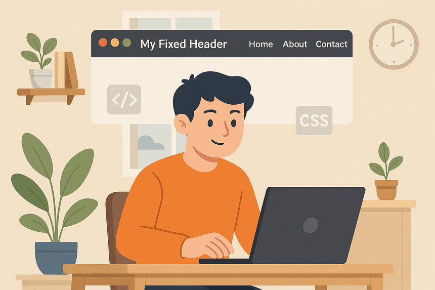
👁️ Preview
🛠️ Step 1: Basic HTML Structure
We’ll begin by creating a simple HTML file with a header and some content to scroll.
<!DOCTYPE html>
<html lang="en">
<head>
  <meta charset="UTF-8" />
  <meta name="viewport" content="width=device-width, initial-scale=1.0" />
  <title>Fixed Header Example</title>
  <link rel="stylesheet" href="styles.css" />
</head>
<body>

  <header class="main-header">
    <h1>My Fixed Header</h1>
    <nav>
      <a href="#">Home</a>
      <a href="#">About</a>
      <a href="#">Contact</a>
    </nav>
  </header>

  <main class="content">
    <p>Scroll down to see the fixed header in action.</p>
    <!-- Repeat content to enable scrolling -->
    <div class="filler">
      <p>Lorem ipsum dolor sit amet...</p>
      <!-- You can duplicate this or use lorem ipsum to fill -->
    </div>
  </main>

</body>
</html>
🎨 Step 2: Styling the Header with CSS
Now let’s create the styles.css file and apply styles to make the header fixed at the top of the page.
/* Reset some default margins */
* {
  margin: 0;
  padding: 0;
  box-sizing: border-box;
}

body {
  font-family: Arial, sans-serif;
  line-height: 1.6;
}

.main-header {
  position: fixed;
  top: 0;
  left: 0;
  width: 100%;
  background-color: #222;
  color: #fff;
  padding: 1rem 2rem;
  display: flex;
  justify-content: space-between;
  align-items: center;
  z-index: 1000; /* Keeps header above other content */
  box-shadow: 0 2px 5px rgba(0, 0, 0, 0.2);
}

.main-header nav a {
  color: #fff;
  text-decoration: none;
  margin-left: 1rem;
  transition: color 0.3s ease;
}

.main-header nav a:hover {
  color: #ffcc00;
}

.content {
  padding: 6rem 2rem 2rem;
}

.filler {
  height: 2000px; /* Just for scrolling demo */
}
💡 Why padding-top in .content?
Since the header is fixed and removed from the normal flow of the page, we add padding to the top of the .content to prevent it from being hidden behind the header.
This is a common best practice in layout design with fixed elements.
✅ Final Thoughts
That’s it! You now have a fixed header using only HTML and CSS, without needing any JavaScript.
This technique works well in most modern browsers and helps you create a better user experience. As a next step, you can:
- Customize the design to match your website
- Make it responsive for mobile
- Add smooth scroll behavior for anchor links
Keep experimenting and building!